Objective - to build on our CSS Grid layout and make it more beautiful
Let's make sure everyone is starting with the same code. Here is the HTML page that we finished Lesson 3 with:

Let's make sure everyone is starting with the same code. Here is the HTML page that we finished Lesson 3 with:
And you'll remember we created a folder called css that we saved at the same level as our index.html file and put in the css rules that we cut out of our original HTML page, we named that new CSS file we cats.css. We saved our two cat images in a folder that we named images.
If you've done everything correctly, your web page should look like this when viewed in your browser:
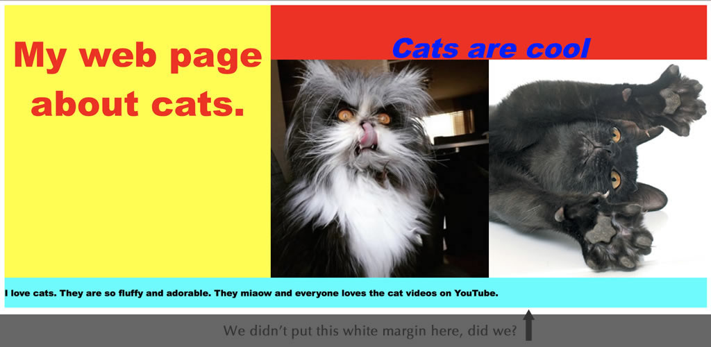
You might notice that your web browser has put a bit of a white margin around the outside of your web page. Different browsers think that they know best, but as a designer we want to start with a 'blank canvas' and add our own margins, borders and padding to our CSS, so we can "reset" this behaviour to zero, by adding this code to the very beginning of our cats.css file:
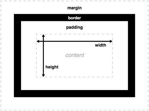
This is a good, but basic CSS reset that you can use. Don't worry if you don't understand it, but by using box-sizing: border-box; we make margins, borders and padding much easier to understand, and our elements won't start getting wider than we want them to be when we add things like padding to them.
You can see that a bunch of other elements like the body, h1, h2 tags etc have also been told to have a margin and padding value of 0. This clears the 'default' margin and padding that a browser can give them.
The last line of code applies to all images, making their maximum width 100% (of their parent element)... this is important so they don't expand to be bigger than we want them to be, and is also great for 'responsive' design - so you don't see a massive 2000 pixel cat on your mobile phone for example!
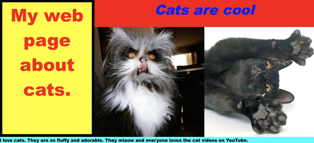
If you refresh your browser you can see that the 'default' margins and padding has been removed, much better! ... and now that we've taken it out, let's put some back in that WE want.
Let's start by giving our main (remember this is the yellow box) a black border. In your cats.css file, let's add a line of css at th end to make the main element style look like this:
We have applied a border with a width of 10 pixels, the line style is solid and the colour is black. There are other line styles, such as 'dotted', 'dashed', 'inset' and a few others.
You should now see that your webpage looks like this, and because we told used box-sizing: border-box; the border has not increased the size of the main element!
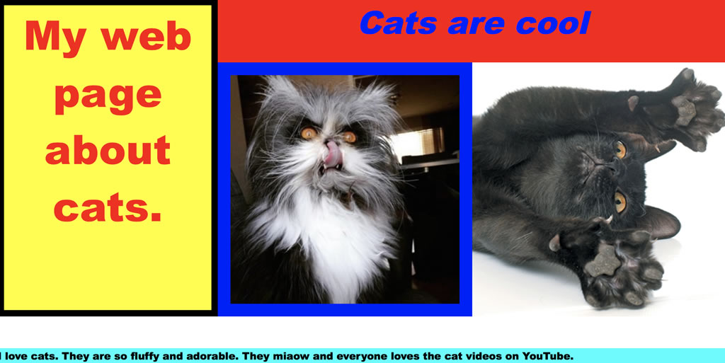
Padding is the distance from the content to the edge of an element. Let's imagine that Cat #1 doesn't like Cat #2 and wants to be separated by 20 pixels from him. We can use padding: 20px to give Cat #1 20 pixels of space all around him, to the edge of his parent element, in this case it's .cat1 in our CSS file. Add this line so you have:
You can see that Cat #1 has padded himself by 20 pixels on all four sides, he'll be much happier with that! Notice that we haven't applied a blue background (when you refresh your browser), it's just the background:blue showing around the edge. Awesome.
With many CSS rules, distances (such as 20px in this case) are done with the rule-of-thumb top right bottom left. What I mean by that to apply a 20px padding all around we could write padding:20px 20px 20px 20px; but if we just write padding:20px; it will apply it to ALL sides.
Let's say Cat #1 only wanted to be 'padded' 20 pixels from Cat #2 (the right side) you could re-write the last line of code for the padding JUST for the right-hand side, like this: padding:0 20px 0 0;. Remember it's top-right-bottom-left, going clock-wise around our element for things like borders, margin, padding etc.
Lastly, margin, which is the distance between one element and the next. Let's imagine we want to put a space (margin) between the footer which was in cyan, and the two cats above it. Remembering the top-right-bottom-left rule, we can write the following and add it to our cats.css file:
You could also write that as:
I hope you've enjoyed the lessons, and keep up with your coding!