
Objective - creating a layout based on a grid sketch
Let's make sure everyone is starting with the same code. Here is the HTML page that we finished Lesson 1 with:
Let's say that we'd like to centre the text content of our headings, both the red H1 and blue H2 tags. You'll remember that in Lesson 1 we did this by adding CSS rules to the HEAD part of our HTML file.
We could add "text-align:center;" to both H1 and H2 elements in our CSS but we can target both H1 and H2 tags in the same rule, by using a comma. So, let's add this code to our CSS styles and we'll put it just before the closing HEAD tag.
Remember that the spelling of 'centre' is americanised, just as we write 'color' and not 'colour'.
Refresh your browser to view the webpage, and you'll now find that the headings are centred in the page. Awesome! Now we've warmed up, let's get ready for some heavy design work!
Creating a layout using CSS Grid
In the 'old days' the best way to create columns and rows for positioning our text and images was to use a table. This method was over-taken by containers, or boxes called 'divs' that were floated left and right but this was quite a tricky business to get right. Recently, browser support for a new system, CSS Grid has evolved so that we can use this to layout our page to achieve more complex designs, and once you get used to it, it's a really easy way to create fantastic looks for our web pages.
Our task today is to create a layout with three columns and three rows and to help us identify each 'cell' in the grid we'll use a background colour. We'll put the our H1 text in a yellow "MAIN" cell on the left, put our H2 tag in a red "HEADER" cell top right, two cat pictures on the right side and a cyan-coloured FOOTER that goes the full width of our grid, like this:
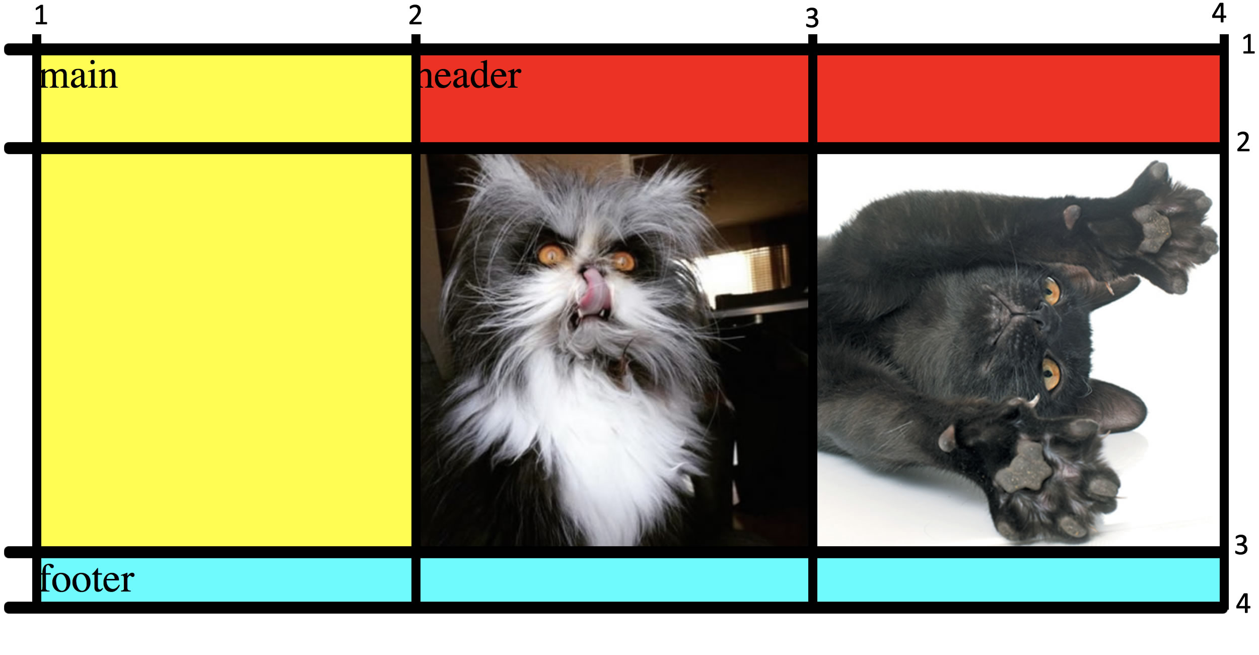
Note that I have numbered the vertical and horizontal lines that create the grid, we will use these when we set the size and position of our grid squares. Are you ready? Let's dive in!
To tell our browser that we are using CSS grid we add display:grid; to our body element in our CSS. Once we've done that, the CSS in the head of our HTML page should look like this for the BODY:
Note: It is important to note that you might NOT want to apply a grid layout to the entire body. For example, you might want to create a DIV or a wrapper that is the "parent" of the grid, but not apply display:grid to the entire BODY. In this case, we're going to apply the grid to our entire HTML page (i.e. all of the contents of the BODY tag).
Now we need to create the grid. We said that we wanted a 3 x 3 grid. I know that the cat images we are using are 400px wide so we want our second and third columns to be 400px wide so the cats fit nicely inside. The first column should make up the rest of the width of our browser window, so we'll use "auto" for that. Here's the CSS code to set the width of our columns in the grid that we apply to the BODY tag:
For the rows, I want to fix the top row at 100px high and as our cat images are square, I want the second row to be 400px high. The footer row I would like to make "auto" so it is only as high as the content of the footer. I could make it a fixed height, but auto will work well here. The CSS code to add to the BODY element for that is:
When you've finished, the CSS for the BODY element should look like this:
Now that we've constructed the grid size, we need to name and make the coloured cells that fit inside the grid. We're going to use the names of MAIN, HEADER and FOOTER, just like in the picture (these are "semantic" HTML tags). We're also going to create two DIVs (divisions) for our cat images. We'll add a class to each of these DIVs for our CSS rules, using a dot or fullstop in our CSS to identify it as a class. The first class we'll cat .cat1 and the second class we'll call .cat2
Let's look at our yellow coloured MAIN cell first. Because "main" is a tag that HTML5 understands, we can simply call it that in our CSS stylesheet, followed by our friend, the curly bracket {
We want the MAIN cell to take up the first column, but only as far vertically as the first and second rows, because the footer is going to be used for the entire third row. We can use some CSS shorthand to set the grid start and end points, remembering that we refer to the lines and not the cells when we are counting. So, for the width we want the MAIN cell to start at the first vertical line and finish at the second vertical line. For the height, we want to start at the first horizontal line and finish at the third horizontal line. We're also going to apply a background colour to it using this CSS. Add this CSS below the BODY CSS and above the H1 CSS.
Now let's move on to the HEADER rule in our CSS. Again, HEADER is a tag that HTML5 understands (don't get it confused with "head" which is where our CSS goes on our HTML page) so we can use "header" as the element name in our CSS. To start the grid cell at the second vertical line and end it at the last vertical line we use: grid-column:2/4; and to have start and finish at the first and second horizontal lines we use: grid-row:1/3;
Finally, let's make the background red. Here's all the CSS code that we'll need to add to the head of our page, put it after the MAIN CSS:
Now we just need to create the two squares for the cat images and our rectangular footer. When we use a CSS "class" we use a dot before it in our CSS. CSS classes are useful for us as designers to create styles that don't apply to regular tags, such as H1, paragraphs, header, main and footer etc. Using the same method for figuring out where our cells for the cats and the footer should start and finish, we can code these like this (remember that we want our footer to be full width and have a background colour of cyan). Follow along, or copy and paste this into your CSS, just below the HEADER rules.
The important thing is that you understand how we start and end these cells and create their position by referencing to our grid lines in the image above.
Creating the HTML
We've done the hard bit, by creating the CSS that will style our grid, now we just need to add the HTML tags to our BODY so that we can see our page in our web browser - because all we've done is code up the grid properties.
We want the MAIN element to be followed by the HEADER element, then the two cat DIVs and then the FOOTER. Although, it's not really essential that we do them in this order because CSS grid will put them where they need to go.
Add this HTML to your page right after the opening BODY tag (note that I've just put some dummy text in to give our tags some content and help us identify them.)
Great work, we're just about done. Now, let's cut and paste our H1, H2 and paragraph tags that we coded previously into our grid. We'll put our H1 tag into the "MAIN" cell, the H2 into the "HEADER" cell and the paragraph into the FOOTER. Go ahead cut and paste your H1, H2 and paragraph tags and paste it over the place-holder dummy text that we have in those areas.
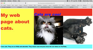
Finally, let's delete the entire line of our last image as we don't want that picture of the cat any more. Save your index.html file and view it in your browser. How did you go?
How your webpage should look
In case you got a bit lost, you can copy and paste the entire code back into your index.html file. Go ahead and play around with the code, colours, sizes of the grid etc - it's how you learn! You can always come back to this web page and copy and paste the code below so we're all starting lesson 3 from the same point! Thanks for coding! Greg
p.s. no homework this week, but if you like coding using CSS grid, here's an excellent tutorial from FreeCodeCamp.
p.p.s Mrs Watling brought up a good point about finding a glossary of coding terms, this is some good reading - a glossary of HTML terms.
In our next lesson we will look at creating a file structure which will help to keep us organised as we add more web pages to our site!
Next lesson